> ## Documentation Index
> Fetch the complete documentation index at: https://asapp-04-04-getting-started-ga.mintlify.site/llms.txt
> Use this file to discover all available pages before exploring further.
# Customization
## Styling
### Themes
There is one main color that you can set to ensure the ASAPP chat view controller fits with your app's theme: `ASAPP.styles.colors.primary`.
ASAPP recommends starting out only setting `.primary` to be your brand's primary color, and adjusting other colors when necessary for accessibility.
`.primary` is used as the message bubble background and in most buttons and other controls.
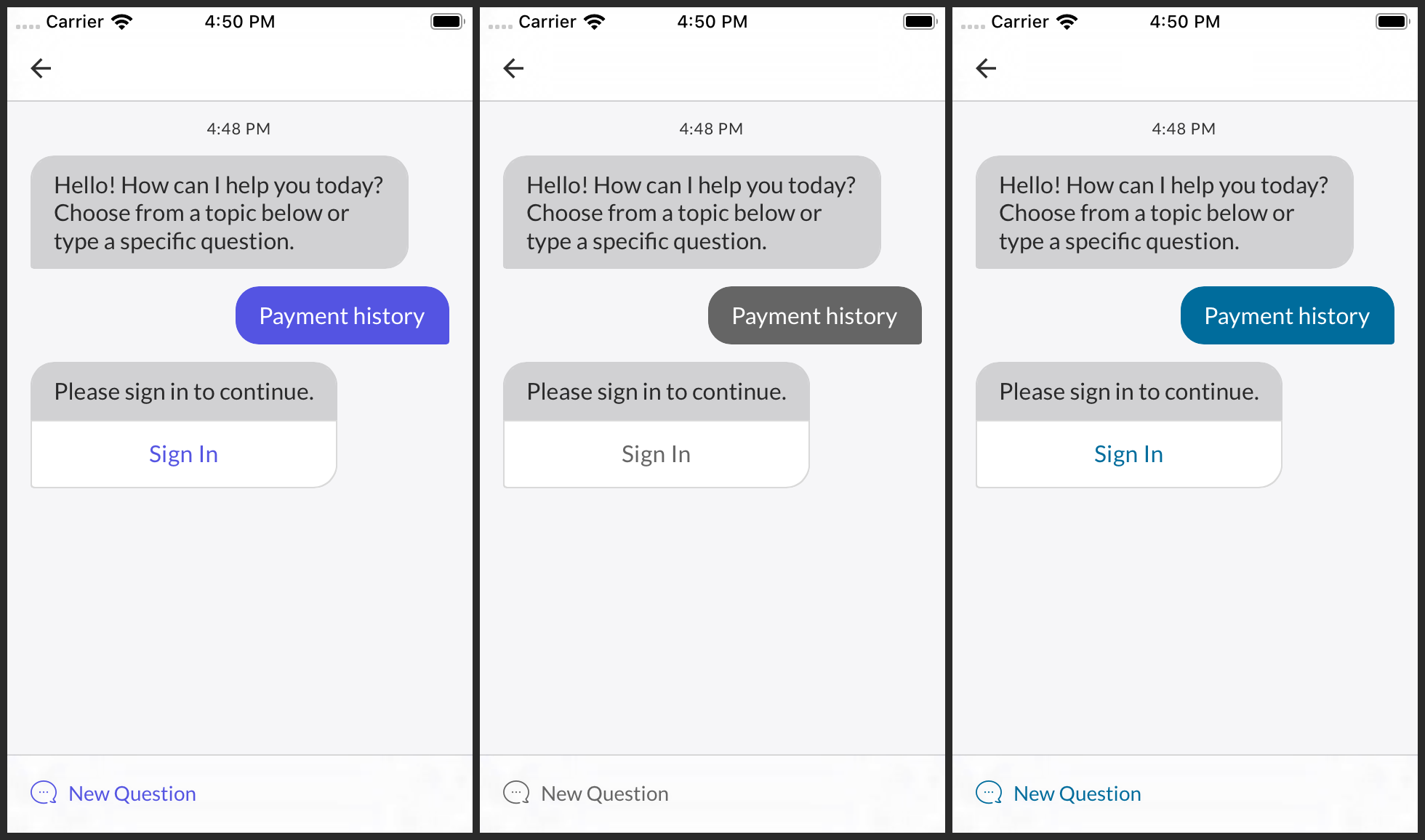 There are two other colors you may consider customizing for accessibility or to achieve an exact match with your app's theme: `ASAPP.styles.colors.onBackground` and `.onPrimary`. `.onBackground` is used for most other elements that might appear in front of the background. `.onPrimary` is used for text and other elements that appear in front of the primary color.
### Fonts
The ASAPP SDK uses the iOS system font family, SF Pro, by default. To use another font family, pass an `ASAPPFontFamily` to `ASAPP.styles.textStyles.updateStyles(for:)`. There are two `ASAPPFontFamily` initializers: one that takes font file names and another that takes `UIFont` references.
```json
let avenirNext = ASAPPFontFamily(
lightFontName: “AvenirNext-Regular”,
regularFontName: “AvenirNext-Medium”,
mediumFontName: “AvenirNext-DemiBold”,
boldFontName: “AvenirNext-Bold”)!
ASAPP.styles.textStyles.updateStyles(for: avenirNext)
```
## Overrides
The ASAPP SDK API allows you to override many aspects of the design of the chat interface, including [colors](#colors "Colors"), [button styles](#buttons "Buttons"), [navigation bar styles](#navigation-bar-styles "Navigation Bar Styles"), and various [text styles](#text-styles "Text Styles").
### Colors
Besides the colors used for themes, you can override specific colors in a number of categories:
* Navigation bar
* General chat content
* Buttons
* Messages
* Quick replies
* Input field.
All property names mentioned below are under `ASAPP.styles.colors`.
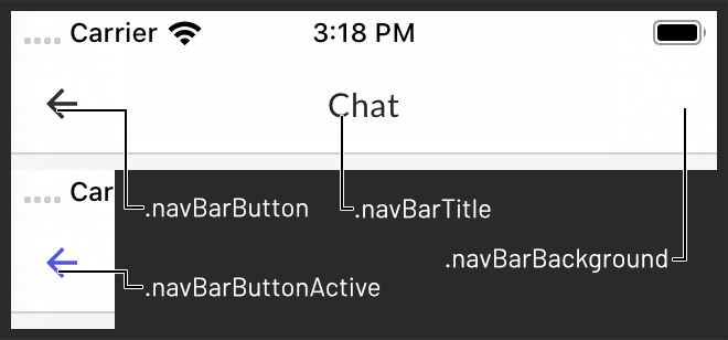
Navigation bar colors are .`navBarBackground`, `.navBarTitle`, `.navBarButton`, and `.navBarButtonActive`.
There are two other colors you may consider customizing for accessibility or to achieve an exact match with your app's theme: `ASAPP.styles.colors.onBackground` and `.onPrimary`. `.onBackground` is used for most other elements that might appear in front of the background. `.onPrimary` is used for text and other elements that appear in front of the primary color.
### Fonts
The ASAPP SDK uses the iOS system font family, SF Pro, by default. To use another font family, pass an `ASAPPFontFamily` to `ASAPP.styles.textStyles.updateStyles(for:)`. There are two `ASAPPFontFamily` initializers: one that takes font file names and another that takes `UIFont` references.
```json
let avenirNext = ASAPPFontFamily(
lightFontName: “AvenirNext-Regular”,
regularFontName: “AvenirNext-Medium”,
mediumFontName: “AvenirNext-DemiBold”,
boldFontName: “AvenirNext-Bold”)!
ASAPP.styles.textStyles.updateStyles(for: avenirNext)
```
## Overrides
The ASAPP SDK API allows you to override many aspects of the design of the chat interface, including [colors](#colors "Colors"), [button styles](#buttons "Buttons"), [navigation bar styles](#navigation-bar-styles "Navigation Bar Styles"), and various [text styles](#text-styles "Text Styles").
### Colors
Besides the colors used for themes, you can override specific colors in a number of categories:
* Navigation bar
* General chat content
* Buttons
* Messages
* Quick replies
* Input field.
All property names mentioned below are under `ASAPP.styles.colors`.
Navigation bar colors are .`navBarBackground`, `.navBarTitle`, `.navBarButton`, and `.navBarButtonActive`.
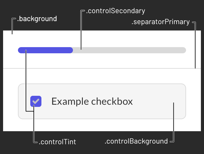
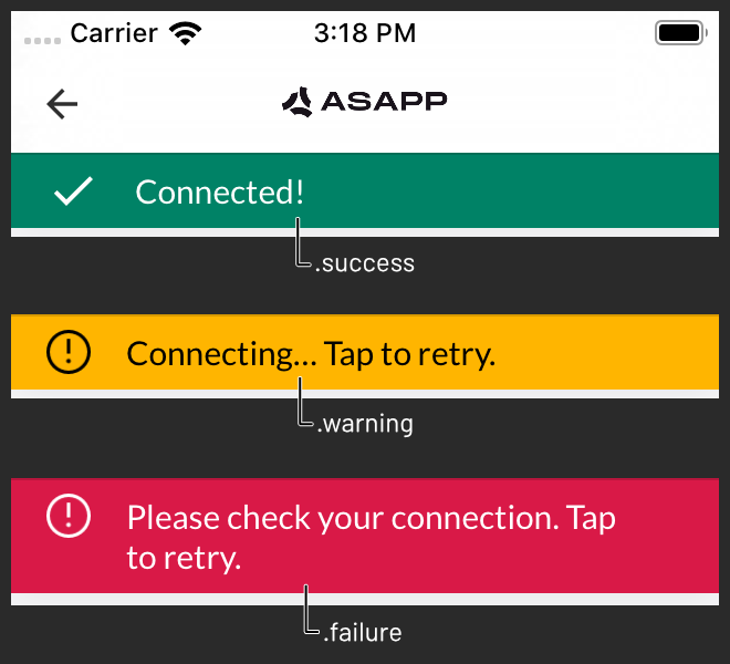
 General chat content colors are `.background`, `.separatorPrimary`, `.separatorSecondary`, `.controlTint`, `.controlSecondary`, `.controlBackground`, `.success`, `.warning`, and `.failure`.
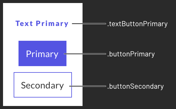
 Buttons use sets of colors defined with an `ASAPPButtonColors` initializer. You can override `.textButtonPrimary`, `.buttonPrimary`, and `.buttonSecondary`.
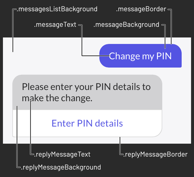
 Message colors are `.messagesListBackground`, `.messageText`, `.messageBackground`, `.messageBorder`, `.replyMessageText`, `.replyMessageBackground`, and `.replyMessageBorder`.
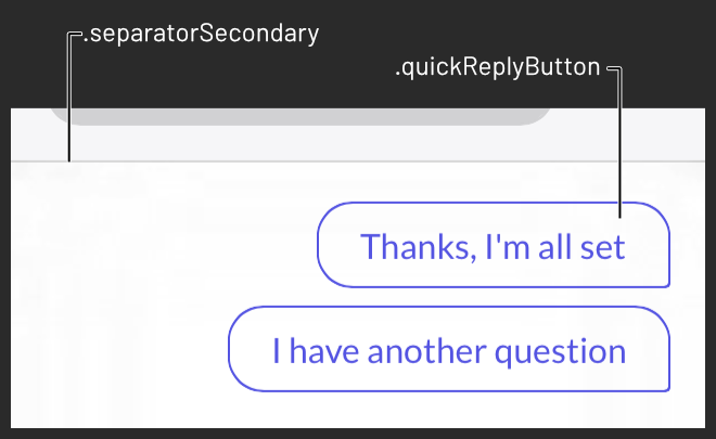
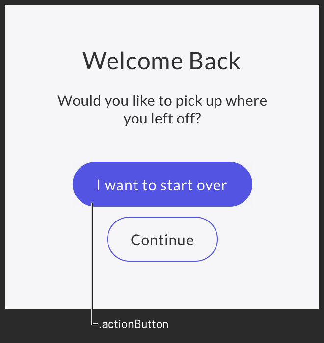
 Quick replies and action buttons also use `ASAPPButtonColors`. You can override `.quickReplyButton` and `.actionButton`.
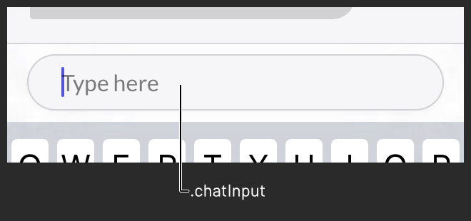
 The chat input field uses `ASAPPInputColors`. You can override `.chatInput`.
 ### Text Styles
ASAPP strongly recommends that you use one font family as described in the [Fonts](#fonts) section. However, if you need to, you may override: `ASAPP.styles.textStyles.navButton`, `.button`, `.actionButton`, `.link`, `.header1`, `.header2`, `.header3`, `.subheader`, `.body`, `.bodyBold`, `.body2`, `.bodyBold2`, `.detail1`, `.detail2`, and `.error`. To update all but the first four with a color, call `ASAPP.styles.textStyles.updateColors(with:)`.
### Navigation Bar Styles
You can override the default `ASAPP.styles.navBarStyles.titlePadding` using `UIEdgeInsets`.
### Buttons
The shape of primary buttons in message attachments, forms, and other dynamic layouts is determined by the value of `ASAPP.styles.primaryButtonRoundingStyle`. The default value is `.radius(0)`. You can set it to a custom radius with `.radius(_:)` or fully rounded with `.pill`.
## Images
### Navigation Bar
There are three images used in the chat view controller's navigation bar that are overridable: the icons for the **close ✕**, **back ⟨**, and **more ⋮** buttons. Each is tinted appropriately, so the image need only be a template in black with an alpha channel. ASAPP displays only one of the **close** and **back** buttons at a time; the former is used when the chat view controller is presented modally, and the latter when pushed onto a navigation stack.
```json
ASAPP.styles.navBarStyles.buttonImages.close
ASAPP.styles.navBarStyles.buttonImages.back
ASAPP.styles.navBarStyles.buttonImages.more
```
Use the `ASAPPCustomImage(image:size:insets:)` initializer to override each:
```json
ASAPP.styles.navBarStyles.buttonImages.more = ASAPPCustomImage(
image: UIImage(named: “Your More Icon Name”)!,
size: CGSize(width: 20, height: 20),
insets: UIEdgeInsets(top: 14, left: 0, bottom: 14, right: 0))
```
### Title View
To use a custom title view, assign `ASAPP.views.chatTitle`. If you set a custom title view, it will override any string you set as `ASAPP.strings.chatTitle`. The title view will be rendered in the center of the navigation bar.
## Quick Reply View Height
To set quick reply view height, assign value to 'maxQuickReplyViewHeight' variable which is part of the class 'ASAPPCustomViewStyles'. We have added a safe height value calculation based on the value provided to 'maxQuickReplyViewHeight' and the quick replies contents data. We should not allow any random higher value to maxQuickReplyViewHeight. The quickReplies height view should not increase to the middle of the iPhone as the chat conversation list view contents visibility will be reduced. Hence we have added a safe height value calculation logic to avoid such UI issues. You can try different values like 180, 240, 300 etc to check the UI. You can set the preferred tint color to 'titleBar.actionBackButton'
```json
let customViewStyle = ASAPPCustomViewStyles()
customViewStyle.maxQuickReplyViewHeight = 300
customViewStyle.titleBar.actionBackButton = OptionalButtonTypeConfig(
tintColorNormal: UIColor.orange
)
ASAPP.views.customViewStyle = customViewStyle
```
## Dark Mode
Apple introduced Dark Mode in iOS 13. Please see Apple's [Supporting Dark Mode in Your Interface](https://developer.apple.com/documentation/xcode/supporting_dark_mode_in_your_interface) documentation for an overview.
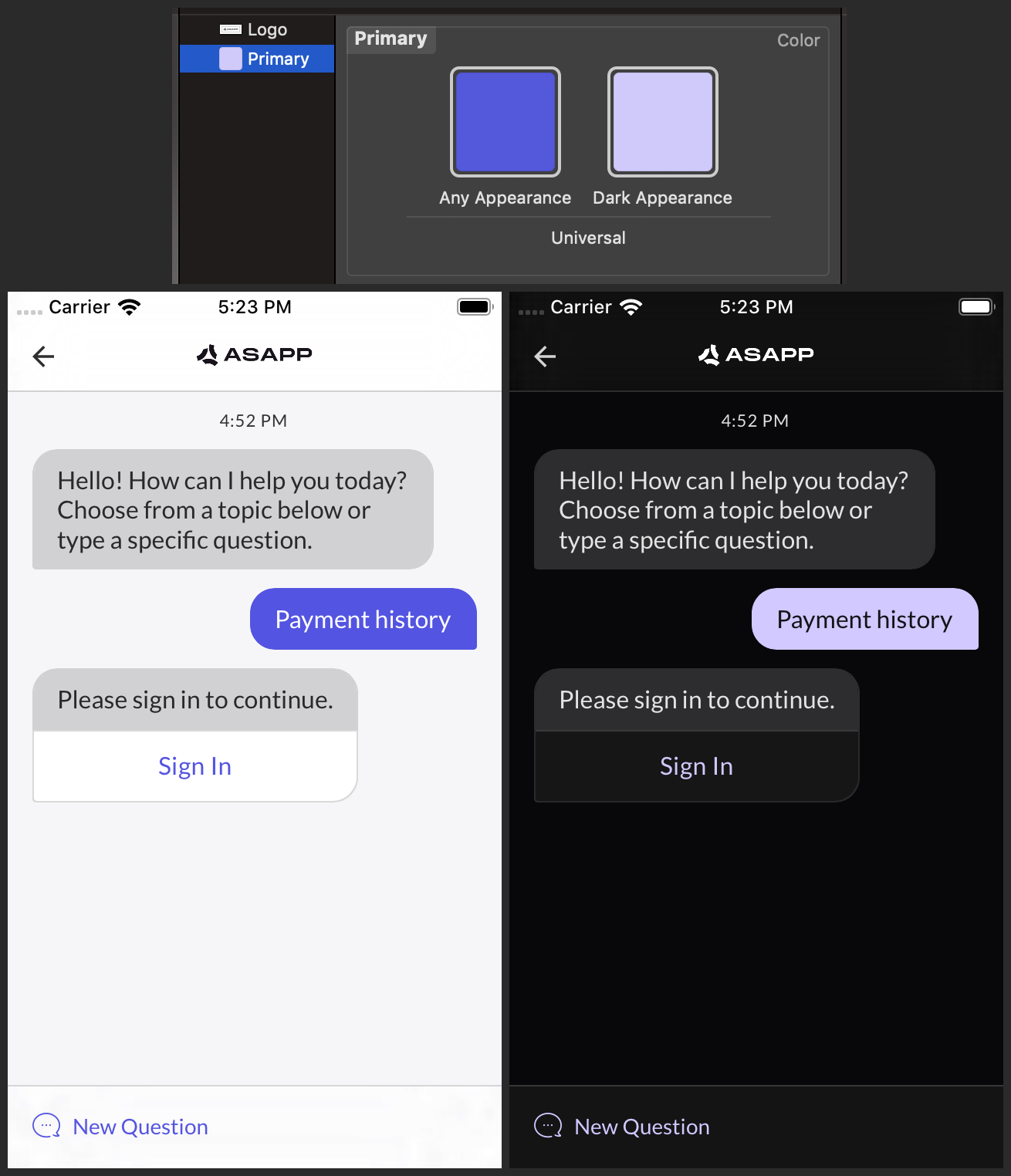
The ASAPP SDK does not automatically convert any colors for use in Dark Mode; you must define dark variants for each custom color at the app level, which the SDK will use automatically when the interface style changes.
ASAPP recommends that you add a Dark Appearance to colors you define in color sets in an asset catalog. Please see [Apple's documentation](https://developer.apple.com/documentation/xcode/supporting_dark_mode_in_your_interface#2993897) for more details. Once you have defined a color set, you can refer to it by name with the `UIColor(named:)` initializer, which was introduced in iOS 11. After you have defined a dark variant for at least the primary color, be sure to set it and flip the Dark Mode flag:
```json
ASAPP.styles.colors.primary = UIColor(named: "Your Primary Color Name")!
ASAPP.styles.isDarkModeAllowed = true
```
ASAPP highly recommends adding a Dark Appearance for any color you set. Please don't forget to define a Dark Appearance for your custom logo if you have set `ASAPP.views.chatTitle`.
If your app does not support Dark Mode, ASAPP recommends that you do not change the value of `ASAPP.styles.isDarkModeAllowed` to ensure a consistent user experience.
### Text Styles
ASAPP strongly recommends that you use one font family as described in the [Fonts](#fonts) section. However, if you need to, you may override: `ASAPP.styles.textStyles.navButton`, `.button`, `.actionButton`, `.link`, `.header1`, `.header2`, `.header3`, `.subheader`, `.body`, `.bodyBold`, `.body2`, `.bodyBold2`, `.detail1`, `.detail2`, and `.error`. To update all but the first four with a color, call `ASAPP.styles.textStyles.updateColors(with:)`.
### Navigation Bar Styles
You can override the default `ASAPP.styles.navBarStyles.titlePadding` using `UIEdgeInsets`.
### Buttons
The shape of primary buttons in message attachments, forms, and other dynamic layouts is determined by the value of `ASAPP.styles.primaryButtonRoundingStyle`. The default value is `.radius(0)`. You can set it to a custom radius with `.radius(_:)` or fully rounded with `.pill`.
## Images
### Navigation Bar
There are three images used in the chat view controller's navigation bar that are overridable: the icons for the **close ✕**, **back ⟨**, and **more ⋮** buttons. Each is tinted appropriately, so the image need only be a template in black with an alpha channel. ASAPP displays only one of the **close** and **back** buttons at a time; the former is used when the chat view controller is presented modally, and the latter when pushed onto a navigation stack.
```json
ASAPP.styles.navBarStyles.buttonImages.close
ASAPP.styles.navBarStyles.buttonImages.back
ASAPP.styles.navBarStyles.buttonImages.more
```
Use the `ASAPPCustomImage(image:size:insets:)` initializer to override each:
```json
ASAPP.styles.navBarStyles.buttonImages.more = ASAPPCustomImage(
image: UIImage(named: “Your More Icon Name”)!,
size: CGSize(width: 20, height: 20),
insets: UIEdgeInsets(top: 14, left: 0, bottom: 14, right: 0))
```
### Title View
To use a custom title view, assign `ASAPP.views.chatTitle`. If you set a custom title view, it will override any string you set as `ASAPP.strings.chatTitle`. The title view will be rendered in the center of the navigation bar.
## Quick Reply View Height
To set quick reply view height, assign value to 'maxQuickReplyViewHeight' variable which is part of the class 'ASAPPCustomViewStyles'. We have added a safe height value calculation based on the value provided to 'maxQuickReplyViewHeight' and the quick replies contents data. We should not allow any random higher value to maxQuickReplyViewHeight. The quickReplies height view should not increase to the middle of the iPhone as the chat conversation list view contents visibility will be reduced. Hence we have added a safe height value calculation logic to avoid such UI issues. You can try different values like 180, 240, 300 etc to check the UI. You can set the preferred tint color to 'titleBar.actionBackButton'
```json
let customViewStyle = ASAPPCustomViewStyles()
customViewStyle.maxQuickReplyViewHeight = 300
customViewStyle.titleBar.actionBackButton = OptionalButtonTypeConfig(
tintColorNormal: UIColor.orange
)
ASAPP.views.customViewStyle = customViewStyle
```
## Dark Mode
Apple introduced Dark Mode in iOS 13. Please see Apple's [Supporting Dark Mode in Your Interface](https://developer.apple.com/documentation/xcode/supporting_dark_mode_in_your_interface) documentation for an overview.
The ASAPP SDK does not automatically convert any colors for use in Dark Mode; you must define dark variants for each custom color at the app level, which the SDK will use automatically when the interface style changes.
ASAPP recommends that you add a Dark Appearance to colors you define in color sets in an asset catalog. Please see [Apple's documentation](https://developer.apple.com/documentation/xcode/supporting_dark_mode_in_your_interface#2993897) for more details. Once you have defined a color set, you can refer to it by name with the `UIColor(named:)` initializer, which was introduced in iOS 11. After you have defined a dark variant for at least the primary color, be sure to set it and flip the Dark Mode flag:
```json
ASAPP.styles.colors.primary = UIColor(named: "Your Primary Color Name")!
ASAPP.styles.isDarkModeAllowed = true
```
ASAPP highly recommends adding a Dark Appearance for any color you set. Please don't forget to define a Dark Appearance for your custom logo if you have set `ASAPP.views.chatTitle`.
If your app does not support Dark Mode, ASAPP recommends that you do not change the value of `ASAPP.styles.isDarkModeAllowed` to ensure a consistent user experience.
 ## Orientation
The default value of `ASAPP.styles.allowedOrientations` is `.portraitLocked`, meaning the chat view controller will always render in portrait orientation. To allow landscape orientation on an iPad, set it to `.iPadLandscapeAllowed` instead. There is currently no landscape orientation option for iPhone.
## Strings
Please see the class reference for details on each member of `ASAPPStrings`.
## Orientation
The default value of `ASAPP.styles.allowedOrientations` is `.portraitLocked`, meaning the chat view controller will always render in portrait orientation. To allow landscape orientation on an iPad, set it to `.iPadLandscapeAllowed` instead. There is currently no landscape orientation option for iPhone.
## Strings
Please see the class reference for details on each member of `ASAPPStrings`.